August 10, 2021
Since the emergence of Cubism in the 1910s, there have been a growing number of artists who use words in their art. During the 20th century, language became paramount to movements such as pop art, feminist art and conceptual art. Now artists like David Shrigley, Mel Bochner and others are using text to explore philosophy and evoke emotion from the viewer.
Artists have been incorporating text into their work since the emergence of Cubism in the 1910s. It wasn’t until art became increasingly ephemeral over the course of the twentieth century, however, that language became paramount to avant-garde art, spearheading movements such as pop art, feminist art and conceptual art.
Now holding a firm place within visual culture, creatives are using text to do everything from exploring their own philosophical pursuits to evoking emotion from the viewer. Whether the words are utilised for their own meaning or co-opted for their typographical aesthetic, we examine seven artists working today that channel the power of the written word, each in their own unique way.
Ed Ruscha
Arguably the modern father of text-based art, Ed Ruscha emerged in the 1960s, alongside the pop art movement. Captivated by the semiotic link between vernacular language and a location’s landscape, Ruscha’s artwork often communicates a site-specific urban experience. Assembling seemingly random phrases on a canvas, the chosen words often seem at odds with one another. Yet, Ruscha’s works are purposefully discordant, conjuring a visual aesthetic that is pleasing, overlaid by a communicative meaning that is incongruous.

ED RUSCHA, SPONGE PUDDLE, 2015
Mel Bochner
Using conversational phrases or colourful lists of synonyms, Mel Bochner transforms everyday words into fine art. The artist rose to prominence in the 1960s and marked a new generation of artists who were seeking to break down the traditional compositional devices used in Abstract Expressionism. Introducing language to his work, Bochner was radical in his approach to painting, a medium that at that time, was going out of fashion. Embracing the conceptual, Bochner’s text-based works became increasingly popular and still remain a favourite among critics and collectors alike.
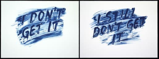
MEL BOCHNER, I DON'T GET IT / I STILL DON'T GET IT, 2014
Massimo Agostinelli
A Swiss based Italian American artist, Massimo Agostinelli is best known for his palindromic text-based works. Taking familiar Western cultural symbols from a range of places like the Bible, art history and popular culture, Agostinelli layers imagery with corresponding text and word play. Cain A Maniac is a typical example of the artist’s work, with the artwork reading the same forwards and backwards.
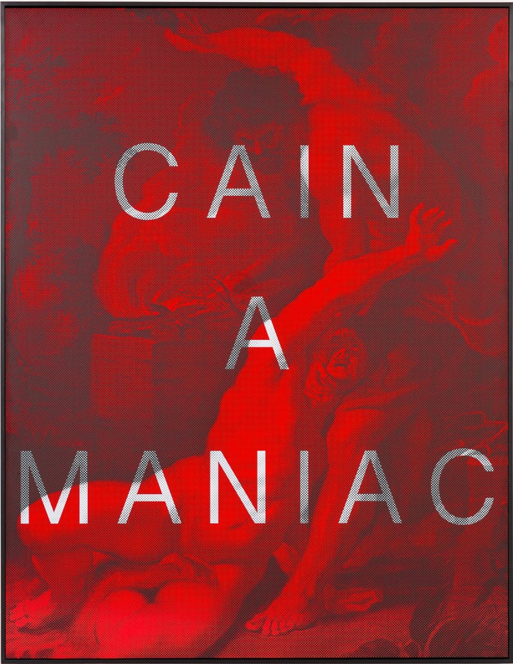
MASSIMO AGOSTINELLI, CAIN A MANIAC, 2015
Harland Miller
Taking inspiration from classic novels, Harland Miller is famed for his witty reimagining’s of Penguin Book Covers. Thanks to his use of words, Miller’s artwork transcends the visual. Once described by art critic and writer Martin Herbert as ‘visual earworms’, the catchy slogans on Miller’s art means that viewers can continue to appreciate his work, long after seeing the image. Using a mix of humour and wordplay, Miller’s work leverages a viewer’s ability to remember catchy phrases over a visual composition.
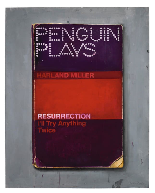
HARLAND MILLER, RESURRECTION (I’LL TRY ANYTHING TWICE), 2013
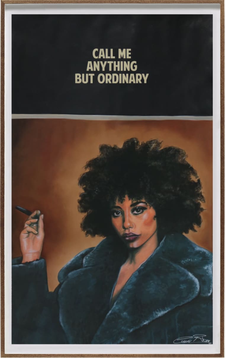
The Connor Brothers
Creating canvases and prints that marry a vintage aesthetic with humorous phrases, The Connor Brothers’ artwork is as witty as it is striking. Inspired by pin-up models and more recently, famous faces, the artistic duo depict beautiful women with sardonic captions. The pair use both words and imagery to fully explore the dichotomies of truth and fiction.
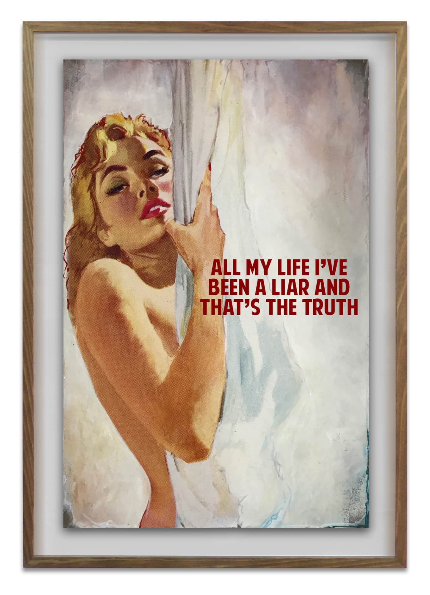
THE CONNOR BROTHERS, ALL MY LIFE I’VE BEEN A LIAR, 2018
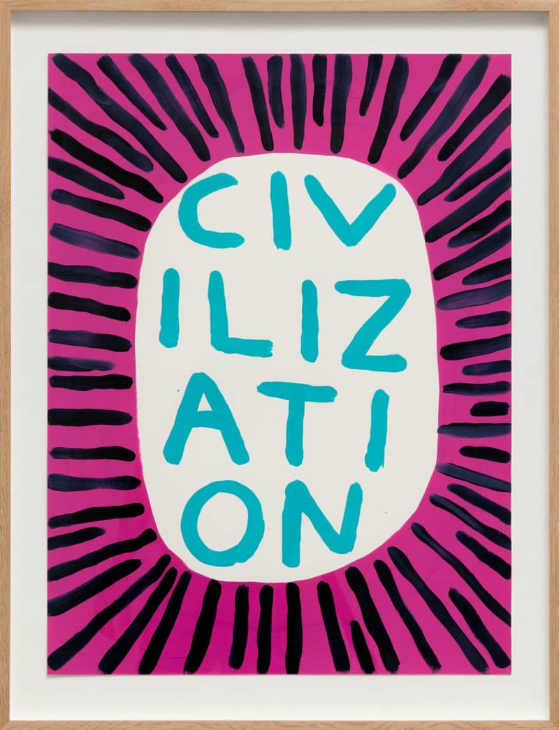
David Shrigley
Known for his surrealist and peculiar prints, David Shrigley is a visual contemporary artist who unites funny phrases with stylised drawings to create prints that are both humorous and encapsulate the idiosyncratic nature of British humour. Always writing his words by hand, and often giving the illusion of the words being spontaneously written, Shrigley’s artwork is a move away from the formalised artwork of Harland Miller and The Connor Brothers and instead embraces the funny, the unusual and the downright odd.
Ben Eine
Originally a graffiti writer, Ben Eine is a prolific street artist who first launched his career by leaving his tag all over London. Developing his own distinctive typographic style, Eine’s murals are easily identifiable and can be found everywhere from the United Kingdom to the United Arab Emirates. Eine’s use of words hinge more upon the aesthetic value of certain letters rather than their overall meaning; and yet, his colourful renderings often hold an uplifting message that reflect his bright and vivid palette.
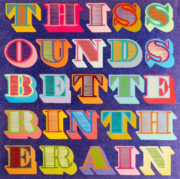
BEN EINE, THIS SOUNDS BETTER IN THE RAIN, 2013

Basket
Please note items are not reserved until you have completed checkout.
No items found
Close
Your saved list
This list allows you to enquire about a group of works.
No items found
Enter your email to subscribe to our weekly newsletter.
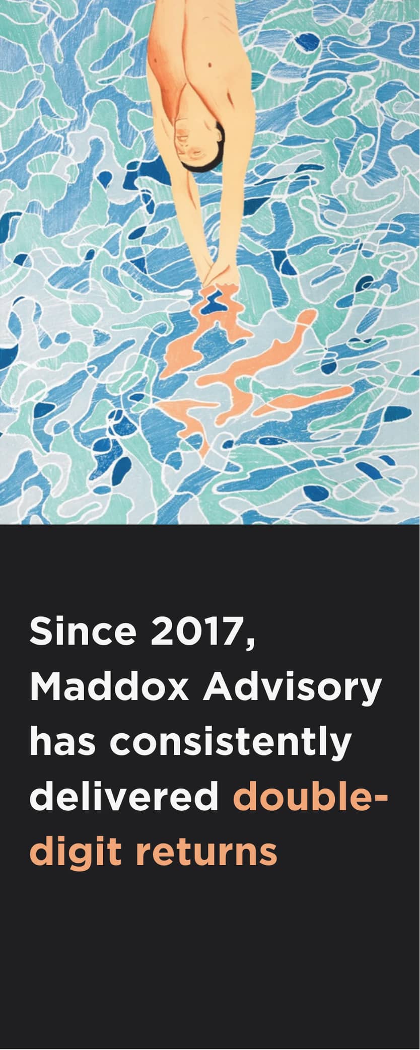
Speak to a Maddox Art Advisor
Please enter your details below and someone from Maddox Gallery will call or email you back.
Mikael B
Register your interest in
Mikael B
Ross Muir
Register your interest in
Ross Muir
Andy Gotts
Register your interest in
Andy Gotts
Seb Chaumeton
Register your interest in
Seb Chaumeton
Miaz Brothers
Register your interest in
Miaz Brothers
The Connor Brothers
Register your interest in
The Connor Brothers
Jerkface
Register your interest in Jerkface.
Register your interest in
London
Gstaad
Los Angeles